When it came to highlighting Pushpay’s technology for an (admittedly tech-averse) audience, approach was everything. Lead with what you’re proud of, and who you make it for. Highlight what your customers can expect to get for their money, and how it makes day-to-days better.
Reduce cognitive load, simplify the offering and make it meaningful
The onus should not be on a viewer to infer the intrinsic value of a (often tiny, often out-of-context) product screenshot. Instead, we create a positive point of interruption and a moment of gamified consideration with a storytelling approach to micro-processes. Users: “This feels different.”
Rather than lean on the clinical problem/solution lead up, we get to the good stuff and center customer benefit in a bite. Features are called forward with strategic color layering, dynamic movement through deep space and a restrained use of textured elements.
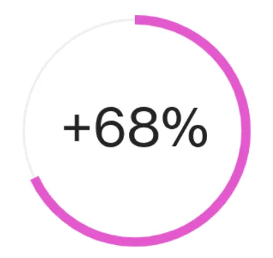
of B2B buyers want brands to understand their personal needs before making a buying decision.