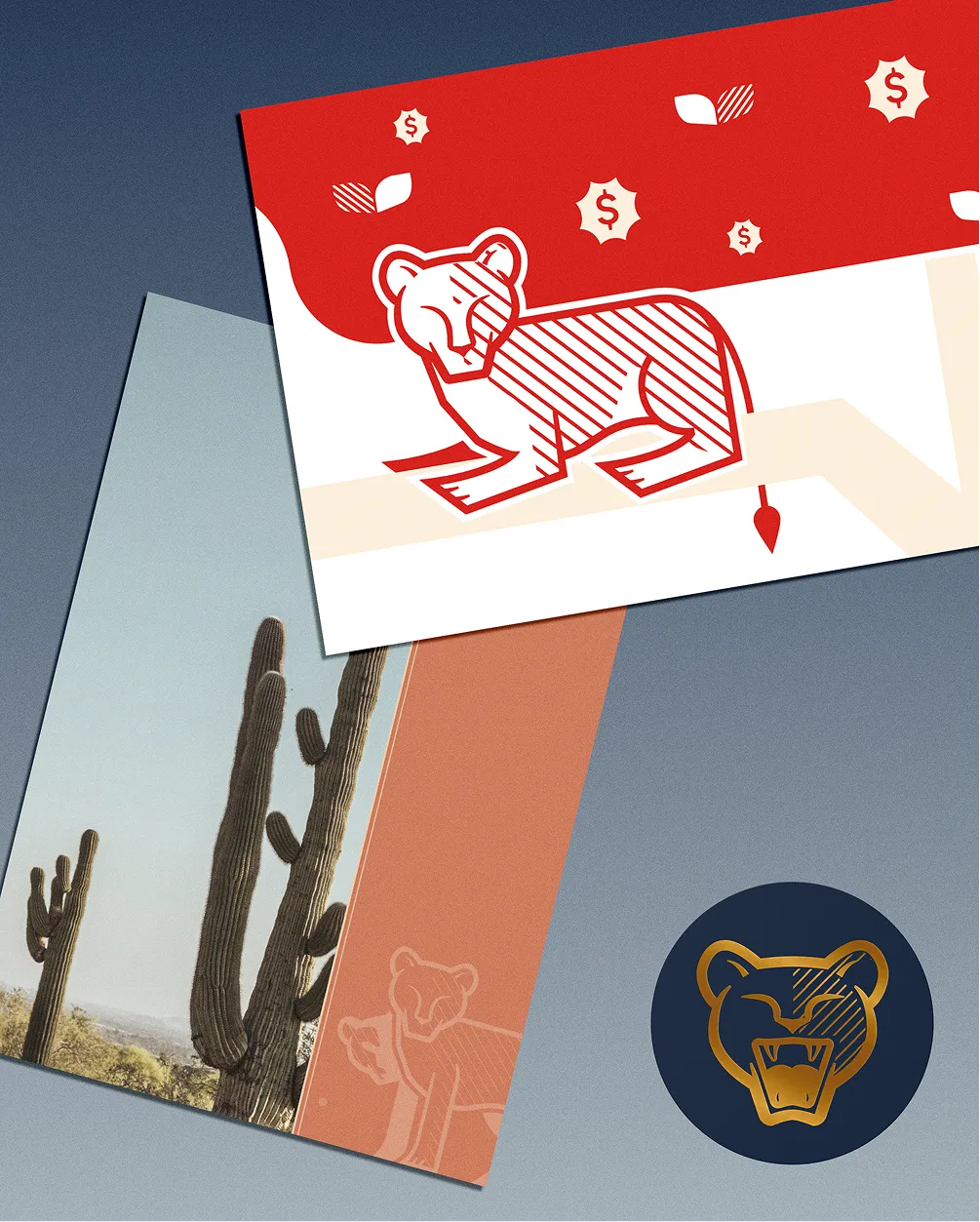
what do you get when you cross hard KPIs with mother-lion loyalty? a brand with teeth.
The Lioness Collective called for a brand that could hold both sides of its founder: the wartime operator with hard KPIs and the mother-lion who writes handwritten notes to her people. They needed a partner who understood that duality — one who could turn fire, clarity, and leadership into a system built to last.
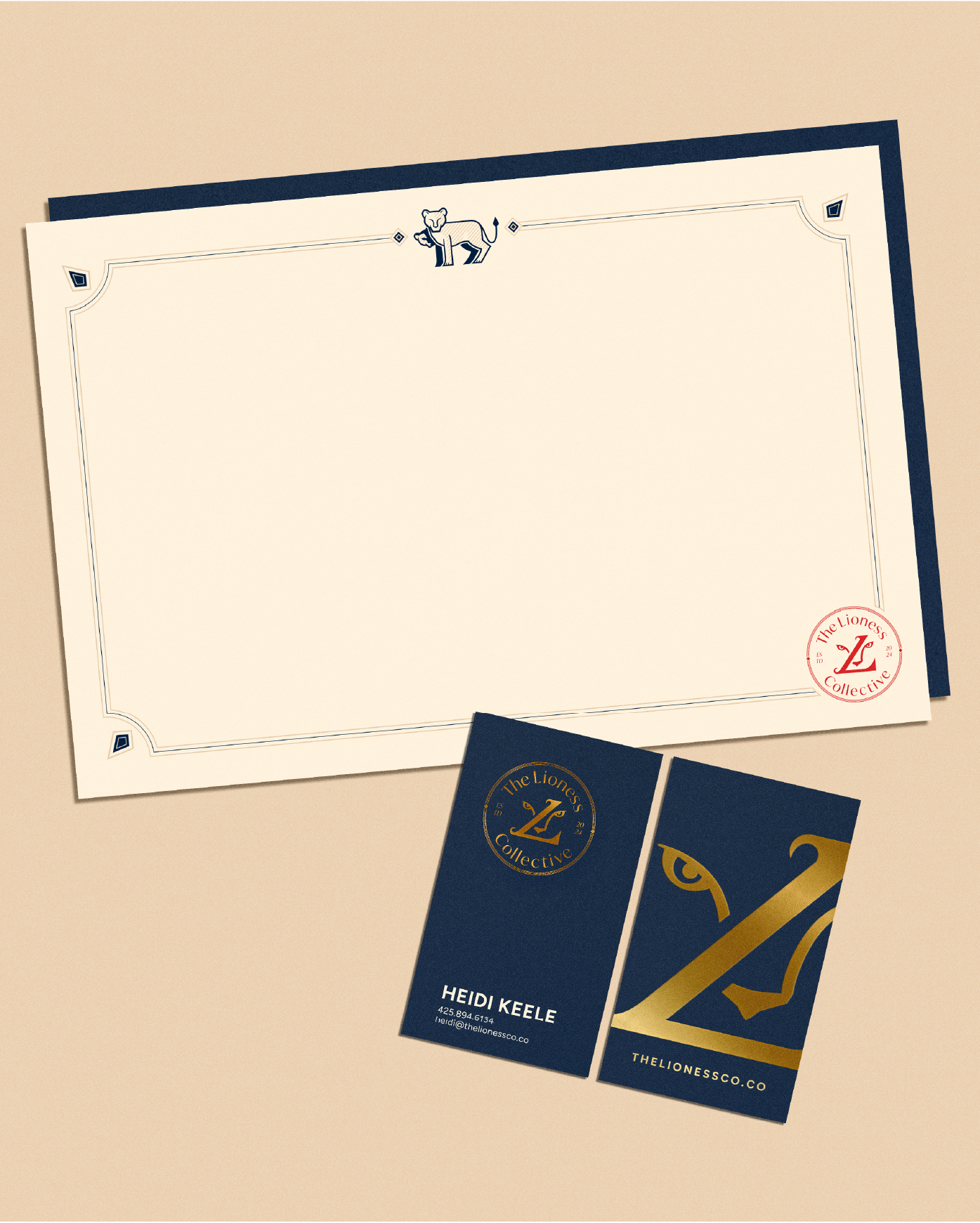
We created the entire brand foundation from scratch: identity, voice, collateral, and a digital experience shaped by desert grit and decisive intelligence.
0%
World Economic Forum
of VC funding goes to women. We think that's skimpy, too.
Women-led companies generate more revenue per dollar invested.
You don't have to hustle if you can hunt.
Women-led companies outperform per dollar raised because there’s no room for waste. We saw that same discipline in Lioness from the start — and built a brand system designed to protect, sharpen, and scale the offer.
The approach
designing a strategy that knows how to hunt
This was was about capturing presence. The clarity of a seasoned operator, the protective instinct of a lioness, and the confidence of someone who has actually done the work. The palette nods to the environment she lives in, but the personality and posture of the brand come straight from the lioness: focused, alert, and unwilling to waste a word or a pixel.
We shaped the voice and visual language together, building a tone that is direct, results-driven, and grounded in loyalty — then designed a system that moves with that same certainty. The custom illustrations weren’t created as “art,” but as operational storytelling. Each scene shows lionesses doing what she does daily: navigating risk, reading the lay of the land, evaluating options, mapping paths, guarding resources, or moving the pride toward the next goal. They function like strategy diagrams hidden inside a visual metaphor — a blend of instinct, discipline, and pattern recognition.
That same clarity guided the digital experience. The site speaks as strongly as it looks: clean paths, decisive hierarchy, and language that respects a leader’s time. The visuals — lioness-led scenes, grounded color, confident spacing, environmental undertones — reinforce the feeling of being led by someone who sees both the terrain and the opportunities within it. The result is a presence that feels sharp, grounded, and human — a brand built for leaders who expect clarity, accountability, and movement.